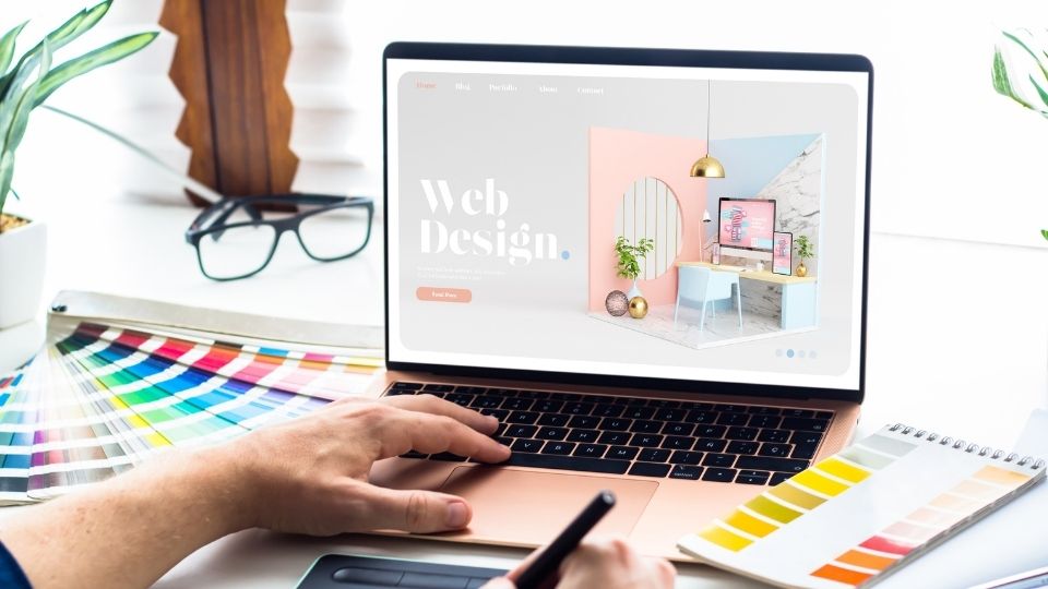
Every site owner out there wants their users to enjoy their experience when they visit their site. If you pay close attention to the latest trends you will notice that usability is the most important consideration today. People are spending a lot of time online and if your site is not easy to use then you may as well be throwing money out of the window. Let’s take a look at some of the key areas that we consider when building user friendly websites.
Mobile Responsive
Most online activity today is done on mobile devices, in fact, most online activity is actually done on mobile devices. If you plan on building a website then you want to make sure that you are putting forth a mobile friendly experience. What this means is that your website should be able to be read and viewed on a smartphone. It doesn’t matter if you have a site which is going to appeal to desktop users only. The way people view content on the internet is vastly different on desktop and mobile.
Clean Design
It is almost impossible to keep the design of your website up to date. Sites, such as, Facebook are constantly being updated and modernised. Unfortunately, that is not possible for your website. So how does a site remain modern? By keeping up with designs that you see every day.
For example, if you were to view your website on your smartphone you would see that it looked different from the site that you viewed on your desktop. The best option is to design a website that can be viewed on multiple platforms and devices. For example, a site that can be seen on a desktop, a tablet and a smartphone.
Easy Navigation

Let’s be honest, if your site is not easy to navigate then most people will not bother visiting it again. This is where having a well set out site which makes it easy for users to click through is important. If the user has to click through to many pages to get to what they are looking for then you are not making it easy for them. Remember that they are probably just browsing to have some fun and they are not there for a serious purpose.
Visual Content

Most people use the internet for entertainment purposes. This means that they want to be able to have experiences which inspire them or to learn something new. Utilising interesting images and videos is one of the best ways to engage your users. It drives them to spend more time on your site.
Help People Find the Information They Want
If your website is complicated to navigate then customers will not stick around. It is simple enough to get the navigation of your site wrong. One way to make it worse is to make the site too wide and just cram as many links, menus and buttons as possible onto one page. The last thing you want is for a customer to click on the wrong link and have to navigate through the back pages of your site to find what they are looking for.
One way of ensuring that people are able to find what they are looking for is by designing a site that clearly outlines what type of information can be found. This can be done by using an information hierarchy. In your site, you could have one page which includes text only, links to pages or videos. This structure could then lead to a series of pages with more detailed information and in each of these pages there could be links to more information about that particular subject.
All of this leads up to the homepage where anyone can access the site. Your homepage should be clear with links which show customers exactly what the homepage has to offer.
Call to Action
There are a host of different ways to engage your users. For example, you could put surveys or other calls-to-action on your site. We want our site visitors to interact with us in some way. When we think about wanting to build a user friendly website, we want to think about where to put these CTAs.
Interactivity
People want to interact with your content. There are plenty of different types of interaction, for example, polls, reviews, Q&As and many other things. Interactivity is extremely important for your users to engage with your content.
Text Is King
Your website should firstly be clear. When you think of a website the first thing that comes to mind is text. Text is everywhere. The website will usually consist of text which a customer can read, words which you can click on to read a more detailed explanation as well as text which appears as speech.
Text is and will always be the most important part of your website. If you only use images then any text which is read out will be difficult to read. However, if you use text that is readable and succinct, the important information will stand out and it will allow for customers to gain an understanding of the website.
Make it Fast
A customers attention span is decreasing. Technology is taking over and people don’t want to be connected to your website through a slow loading page. Also, by loading fast, your visitors will spend more time on your website. This will help with SEO as people spend more time on your website and more likely they will buy.
Final Words
We hope that this article has helped you to understand what you need to do to create a user friendly website.

